A Chart is Worth 96,000 Collisions
Gigabyte upon gigabyte of data is collected every day in our high-tech society. Unfortunately it's virtually useless in its raw form; it needs to be analyzed for patterns and/or "exceptions" to patterns. When studying the over 96,000 automobile collisions that took place in New York City during an entire year, data visualization can help.
In journalism, these patterns and exceptions can be interesting and worth investigating further. A story may be hiding in a new pattern, or in an exception to an expected pattern. News organizations like ProPublica and The New York Times use data analysis and data visualization as the basis for -- or in support of -- some of their investigations.
Motivation
My initial motivation was to create a calendar heat map: To take data for occurrences that happen multiple times a day, and to color each day of a month according to the number of times an event takes place.
For example, if I was a birdwatcher and I wanted to keep track of how often I saw a particular bird species, I would color the calendar days based on the number of sightings: A day with no sightings has a white background; a day with five sightings is light blue, and on a good day with 10 sightings I'd use a darker blue.
But before I start building my heat map, I want to find some real-world data, instead of creating some imaginary bird-sighting data.
Open Data
Thankfully the concept of Open Data, or sharing data publicly, has become popular. Examples of organizations promoting Open Data are the Open Data Institute and the Open Data Initiative.
After doing a bit of web searching I find NYC OpenData, a site that offers "free public data published by New York City agencies and other partners." The specific data I choose is a file containing all automobile collisions in New York City in 2023. The data is available in a single CSV file, 18.3 MB in size, representing 96,506 collisions.
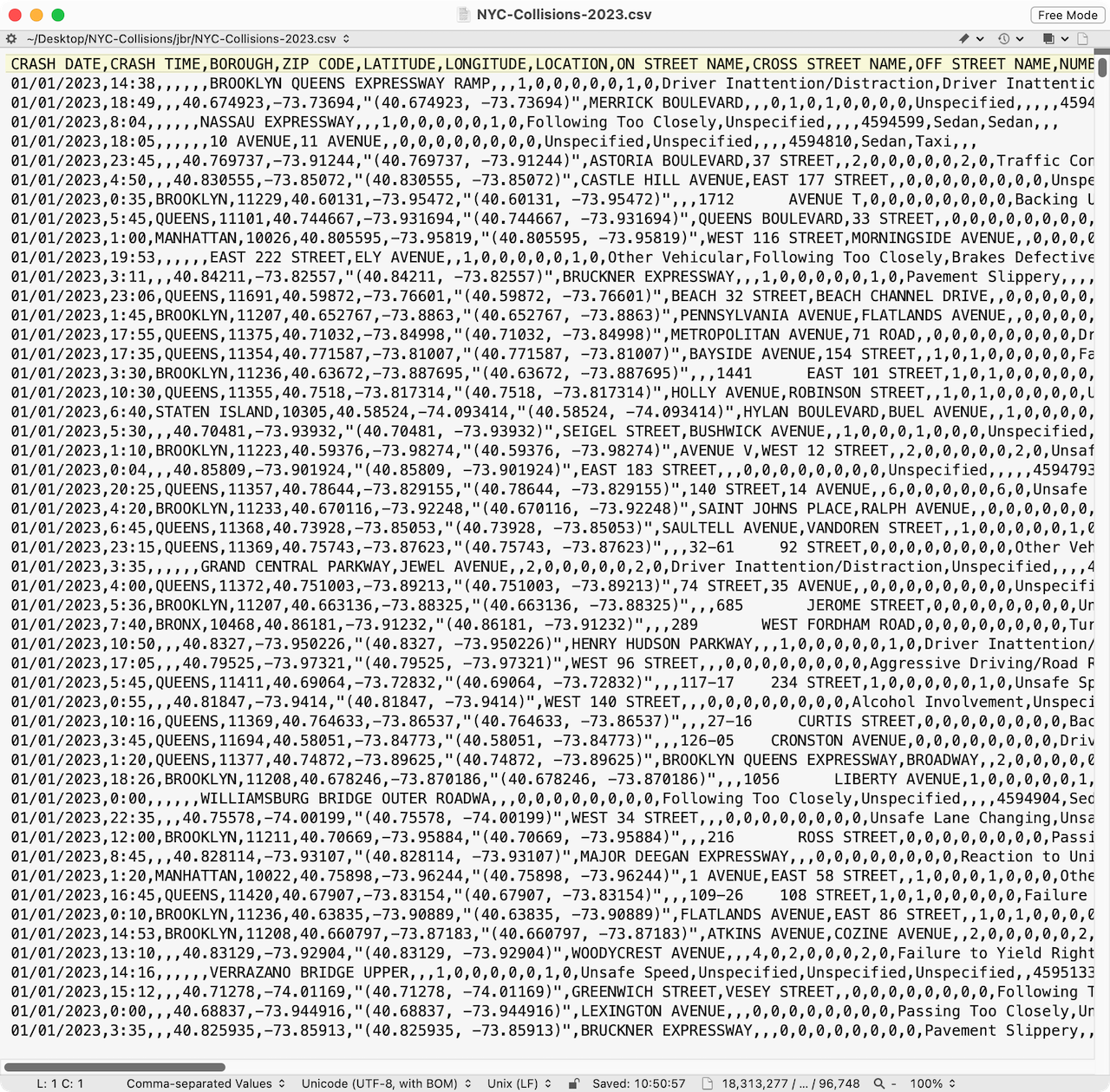
A tiny portion of the CSV file is shown in Figure 1. (Click on thumbnail to enlarge.)
Wrangle (Prepare) the Data
The first step is to read the file, reduce it to only the fields I want, and fix a few things. That requires some data wrangling. Specifically:
- The file has a lot more fields than I need; I want to remove unused fields.
- Somehow some 2024 collisions snuck into the file; I want to remove those.
- The street names, when available, are all UPPER CASE; I want to fix that.
I describe the software tools I use in the Technologies Used section below.
I want to store the resulting cleaned-up data in a database, in order to speed up retrieval and searching of the data: If I'm interested in seeing the collisions for a specific day, I don't want to read the data for the other 364 days.
I've tentatively decided that my app will have two pages:
- the home page showing the full calendar year and the number of collisions on each day
- a page that shows more detail about a chosen month
So I'm going to store the data in two formats, with a bit of duplication for efficiency:
- the daily collision totals
- the detailed information (date, time, location) about each collision
Database & Server
Once I have the data in a useful format in the database, I need a web server to return the data requested by a web browser (or client). Corresponding to how I organized the data in the prior step, the kinds of requests that the client will make are:
- What are the daily collision totals for each month?
- When and where did all the collisions occur on a given date?
The first request only returns the daily totals, without any detailed info about when/where the collision occurred.
I can develop this part of my app and test it before I turn my attention to the client.
Browser / Client
Up to this point, not a lot of thought has been given to how to display the data in the browser; it's more how the browser can request the data efficiently from the server. Now the question is: What kind of relationships do I want to show? What are different ways of looking at the data in order to get insights about the collisions? Here are three questions I want to answer:
- Are there certain days of the week or month that typically have more collisions?
- Are there certain times of the day or night that typically have more collisions?
- Are there certain locations in the city that typically have more collisions?
You can imagine that trying to get this information from the original CSV file would be impossible. Visualizing the data will make it easier.
To try to answer the three questions above, I choose three different graphical techniques: a calendar heat map, a bar chart, and a map, respectively. I'll start with the calendar heat map because that's what got me interested in the demo in the first place.
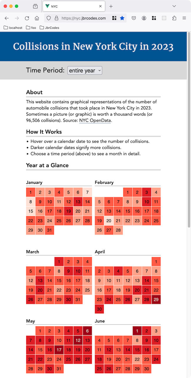
I decide to show the year overview with 12 calendar heat maps on the home page. It's a nice compact way to visually show the number of collisions for each day during a month. The shade of each day's background gives a rough idea of the collision count for that day, and hovering over a day shows the exact number.
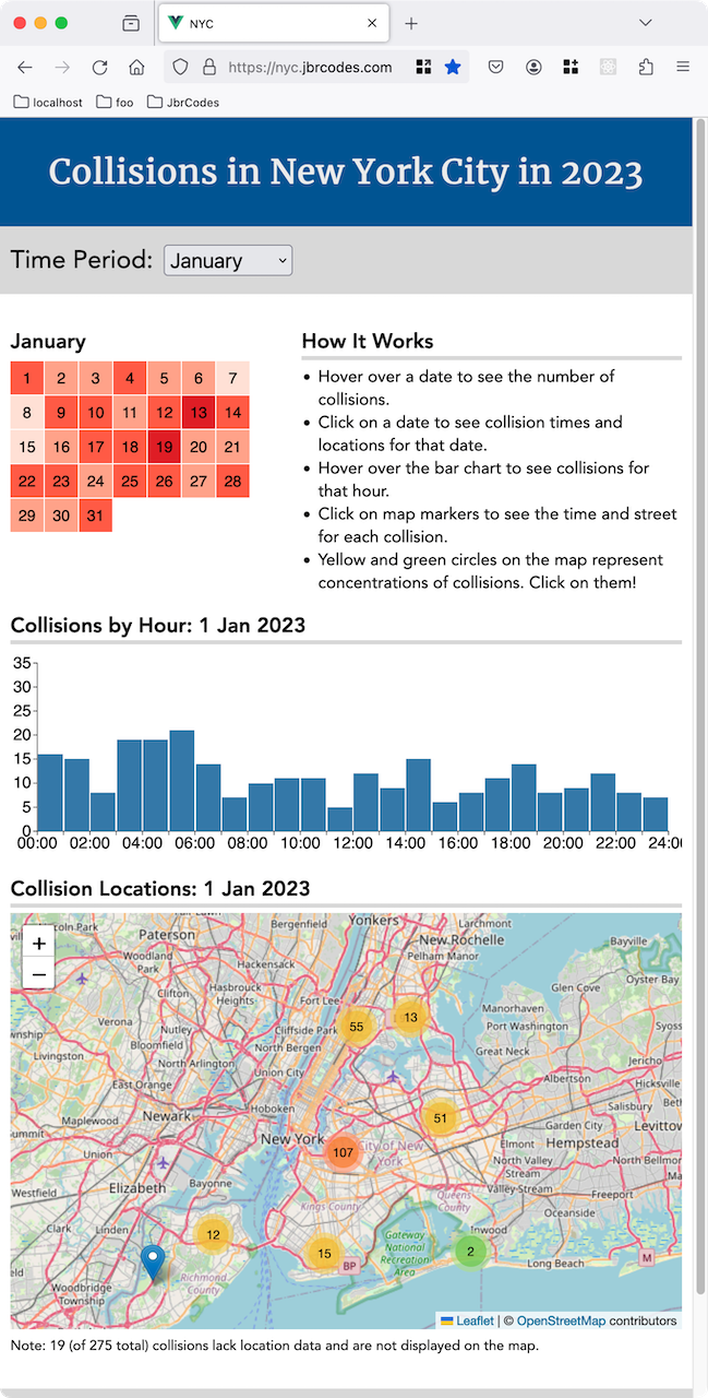
Choosing to focus on a specific month will show three different graphics and let the visitor choose a specific date by clicking on the calendar.
The bar chart shows how many collisions occurred during each hour of that day. And the map shows the locations (when available) of the day's collisions. (Click on the thumbnails below to see an example of each.)
You can explore the data yourself at nyc.jbrcodes.com.
What Did We Learn?
I said at the beginning that we often use data analysis and data visualization to detect patterns and/or exceptions to the patterns. What did our visualizations tell us?
The home page shows an overview of all collisions during the year. We might expect that there would be more collisions on weekends, but the data for 2023 doesn't support this. May seems to be the month with the most dark red days, but this could be coincidence. In December, Christmas Day and New Year's Eve had fewer collisions. Is that what you would expect?
Looking at a specific month, the bar chart shows that rush hours tended to have more collisions, and from midnight to 6:00 AM was quieter, as we would expect. And finally, looking at the map shows that most collisions took place in the central part of the city.
It looks like for this particular data we didn't find anything unusual. That's not a problem, it just means there's possibly no story hidden in the data.
This is often the reality for data analysts: They can spend a lot of time analyzing data, but in the end they may find that there's nothing unusual about the data. There is unfortunately no short cut to see if data is worth analyzing, except to analyze it.
Technologies Used
To create the demo, I used a number of existing software tools that did most of the heavy lifting. (I'm a jack of some trades, master of none.)
Data Preparation
- Pandas
- For data wrangling, the Pandas library lets me manipulate large amounts of data, removing data I don't need, and doing statistical analysis (like computing sums or averages) on the remaining data.
- JupyterLab
- Preparing my data or finding interesting patterns in megabytes (or gigabytes) of data can be a laborious trial-and-error process. JupyterLab lets me break the process down into individual steps, and each time I modify my process, I only have to re-execute the steps I modified, without repeating other possibly time-consuming steps.
Server & Database
- PostgreSQL
- The data is stored in a PostgreSQL database, just one of a number of SQL databases (like Oracle, MySQL, MS-SQL) that are mostly compatible.
- Knex
- The Knex query builder lets me query the database using JavaScript instead of SQL. It also gives me the option of switching to a different (mostly compatible) SQL database without modifying my code.
- Express
- A web browser can't talk directly to a database; there needs to be a web server, as a sort of "middleman," between them. Express is that web server.
Client / Browser
- Vue
- Vue is used to create interactive browser apps that don't need to load a new page every time a visitor to the site clicks on something.
- D3
- D3 is a collection of graphics functions used to create shapes, give them color, and make them interactive. I use it for the calendar heat maps and bar charts.
- Leaflet
- Leaflet creates interactive maps and lets me place a marker at the location of each collision. (The nifty colored circles, representing concentrations of collisions, are thanks to a Leaflet plugin.)